Simplifying our Design System with tokens
Timeline
January 2024 - Ongoing
Role
Designer
What I did
Research, DS structure, token creation
We revamped Banco General’s design system by introducing Figma variables. Starting with colors, we created a flexible foundation for consistent design across the app, reducing redundancy and improving efficiency. While implementation is still in progress, this initiative has already set the stage for scalability, enabling future expansions like dark mode.

Background
As our bank embarked on a complete mobile app redesign, it became clear that our design approach needed more structure. Until then, our design language was fragmented—colors, typography, spacing, and even components varied across screens.
At the time, we didn’t have a formal design system, just a growing UI kit that served as a loose collection of components. Recognizing the opportunity to build a scalable foundation, I joined our small, volunteer-based design system team to introduce a structured approach to design tokens.
Figma’s introduction of variables came at the perfect time, allowing us to define our first-ever design tokens and lay the groundwork for a more cohesive system.
Why we needed a token system
Without a centralized approach to styles, our design team lacked a single source of truth. Colors, typography, and spacing were applied manually across different files, leading to inconsistencies, redundant work, and inefficiencies in design handoff. Developers, meanwhile, had no clear reference for implementation, often working from outdated documentation or making their own interpretations—causing frequent misalignment between design and code.
To solve these issues, we set out to build a unified, flexible, and scalable design token system—one that ensured visual consistency across every element, interface, and platform. More than just aesthetics, we envisioned tokens as living documentation, embedding key design decisions directly into the system so both designers and developers could trust it as a reliable reference.
But implementing this system wasn’t straightforward. We faced three major challenges:
-
Limited developer alignment: Developers weren’t involved early on, making integration with their workflows uncertain.
-
Overcomplication risks: Figma variables were new, and we risked creating an overly complex system that would be hard to adopt.
-
Scalability concerns: Our tokens needed to support global updates (like dark mode), but poor planning could introduce inconsistencies.
On top of this, our small design team of two had to balance this initiative alongside other responsibilities, meaning we had to prioritize impact over perfection.

Our Approach
1. Auditing and defining the token strategy
First, we needed a clear picture of our current situation. We cataloged existing styles—colors, typography, spacing, and more—to identify patterns and inconsistencies.

Based on best practices, we structured our system around:
-
Primitive tokens: Core values like raw color definitions.
-
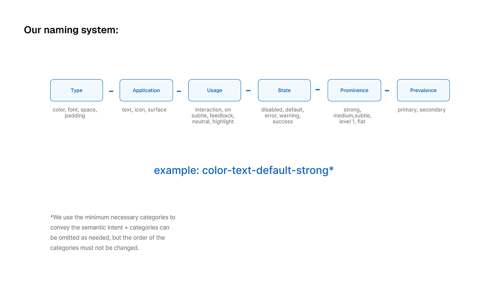
Semantic tokens: Context-based names that mapped to real use cases (e.g., background-primary, button-text).
Semantic naming turned out to be a significant challenge. We needed something broad enough to work across various contexts but not so vague that it became meaningless. Instead of aiming for perfection from the start, we took an iterative approach—quickly putting together a proposal based on our research, testing it, and refining it as we progressed.

2. Testing with designers and developers
To ensure usability, we ran internal usability tests where designers applied the tokens in real scenarios. The feedback was immediate:
-
The naming format led to redundant, overly long tokens in Figma, making them hard to search for and apply.
-
Designers weren’t referencing token names to decide where to apply colors; they were visually matching colors, leading to inconsistencies.
-
The semantic values we chose weren’t descriptive or relevant enough, causing confusion.
We also ran a developer workshop to align on implementation. Although developers weren’t deeply involved at first, their insights during this session helped us address concerns like stylesheet integration and centralized repositories.

3. Simplification and practical application
After stepping away for a few weeks, we revisited our work with fresh eyes. It became clear that we had overcomplicated things—our variables were too specific, and even we struggled to understand them. On top of that, we hadn’t documented our process, making it difficult to retrace our decisions.
At this stage, we questioned our original approach. Our initial proposals were mostly based on what worked for other teams. Now, we had real-world feedback and had to refine the system based on our needs.
To keep things manageable, we decided to focus primarily on color variables. Color is one of the most foundational elements in our design system, and tackling it first provided a solid structure for future token expansions (like spacing and typography).
Instead of overengineering the system, we prioritized practical application:
We applied variables to real screens instead of hypothetical use cases.
We tested token flexibility by implementing dark mode.
We reduced token variations, keeping only what was necessary.
This process wasn’t linear. We went back and forth, revisiting decisions and refining as we encountered new challenges. For example, one of the biggest hurdles was neutral colors. Not only had they been applied inconsistently across components, but we also hadn’t considered factors like elevation until we started testing in dark mode.

Results: a more scalable and usable system
By the end of this phase, we had:
-
Created 100+ color tokens tailored to our components and design culture.
-
Established a flexible, scalable color token structure to ensure consistency across the app, laying the foundation for other types of tokens.
-
Reduced redundant styles, simplifying the system for designers.
-
Improved alignment with development, ensuring smoother handoff and implementation.
-
Laid the foundation for dark mode support, making future enhancements seamless.
This project is just the beginning. Full implementation will be a gradual process, requiring coordination and iteration. But with the foundation we’ve built, we’re confident that our design tokens will provide the consistency, flexibility, and scalability needed to support the bank’s growing digital ambitions.
Key learnings
One of the biggest takeaways from this project was realizing that as designers, we don’t just design products—we also design the processes we use. Initially, we followed a more rigid, by-the-book approach, but we quickly realized it didn’t fit our team’s needs. The key to making this work wasn’t just implementing best practices; it was adapting them to our unique context. This is something I now apply to every project: if the process feels forced, the solution will too.
Collaboration between design and engineering was another key learning. While we worked closely with developers, we also faced challenges—particularly because design systems weren’t yet a top priority for leadership. The development team is expanding rapidly, but foundational structures like a centralized component repository and a cohesive styles library still need to be established. Because of this, integrating design tokens will require additional groundwork before we can fully implement them.
Our design team has been actively pushing for these issues to be addressed, advocating for a more structured approach and encouraging developers to be part of the system’s growth. This is an ongoing effort, but one that will shape the way we collaborate moving forward.

Looking ahead
This project reinforced the power of iterative design, collaboration, and adaptability. While our design token system is still evolving, we’ve built a solid foundation that will support the bank’s digital transformation for years to come. More importantly, we’ve proven that design systems aren’t just about consistency—they’re about creating tools that empower teams to work smarter, not harder.
Our next priority is expanding tokens to typography and spacing, ensuring adoption through better documentation and integration with our component library. We’re excited to continue refining this system, and ultimately, making design at our organization more scalable, efficient, and cohesive.